Drag Drop button
A Drag/drop button is really an image that the trainee can drag around the Lesson screen. A Hot Spot button can then be defined as a target onto which the Drag/drop button can be dropped. You can have multiple Drag/drop buttons and you can have multiple Hot spot buttons defined as targets within a single Element. To create a Drag/drop button:
The Select File dialog will be displayed. Select the file of the image you want to display - the file will immediately be copied into your lesson directory. A Drag/drop button (with the image you selected displayed) will appear in the top left corner of the Lesson Screen and the Drag/drop Button dialog will be displayed with the Drag/drop Button tab active. |
|||
Dialog controls |
See The Interaction Toolbar for information about the dialog controls displayed at the bottom of the dialog box.
|
||
General tab |
|
||
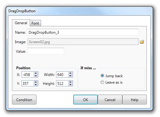
Name |
This is the name of the Drag/drop button interaction (that will be displayed in the Interaction list of the Element dialog). |
||
Image name and Size |
The Image field displays the name of the selected image file - this field can only be changed by selecting a different file using the File button to the right of the Image field. AUTHOR™ supports JPG, GIF, BMP, PNG and WMF formats. (See note below for further information about GIF files). The size of the button is set by the size of the image selected. |
||
Value |
The text you enter into the Value field is used to identify which Drag/drop button has been dropped onto a particular target Hot spot button when the Lesson moves to the Response section. See The Interaction Toolbar for more information. |
||
If miss |
Specify what will happen to the Drag/drop button if the trainee moves it across the screen but does not place it over a defined Hot spot target. |
||
Jump back |
The button will immediately reappear in its original position. |
||
Leave as is |
The button will remain in the position where it was dropped. |
||
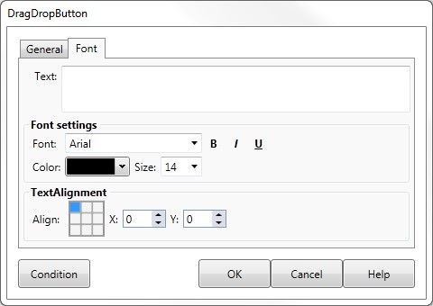
Font Tab |
The Font tab on the Text dialog gives you control of the text displayed on the Drag Drop button, including the:
|
||
Examples of Drag Drop buttons |
See Response EXAMPLES for more information. |
||
|
|||


