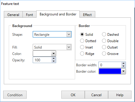
Background and Border tab
While not directly accessible from the Toolbar, the Background and Border tab (or in some cases bg border) is used by a number of Actions for selecting the backgrounds, border and shape of an action. |
||
|
||
Background Properties |
||
Shape |
The first property to set is shape which can be set to:
Depending on which shape you chose some of the properties you can set will change. |
|
Fill |
Fill controls the backround of the actions. The options are:
|
|
Color |
Color is only available if fill is set to solid. This sets the colour of the background. |
|
Start color and End Color |
These are only available if fill is set to linear gradient or radial gradient. Start color is the color of the gradient in the top/left (see angle for chosing start position) of a linearl gradient or the centre of a radial gradient. End color is the color for the bottom/right of a linear gradient or the outside of a radial gradient. |
|
Angle |
Angle is only available for linear gradients. If set to 0 start color will be at the left of the shape and end color at the right, at 90 start color will be at the top, it is variable is steps of 1 inbetween for a diagonal gradient. |
|
Opacity |
Changing Opacity will make the actions background semi-transparent. 100 means it is not transparent at all, 0 is completely transparent, 50 is half way between. |
|
Rx and RY |
These properties are only available on rounded corner rectangles they control how far in the corner is. RX sets how far in from the left/right, RY sets how far from the top/bottom. The maximum value is 30, if either value is 0 it will appear as a square cornered rectangle.. |
|
Border Properties |
||
Border |
There are eight styles of borders which can be put on an action, however some are only available on certain shapes if it is not available for a certain shape the option is greyed out. The border will not be visible and you won't be able to tell the difference between styles unless you have a border width greater than 1. The styles are:
|
|
Border width |
Border width is how thick the border is, 0 is the default which is can not be seen and 30 is the maximum. |
|
Border color |
Sets the color of the border, the default is black. |
|
