Text Input field
The Text input field is used when the trainee is required to type their response into a field. In the Response section of the Element you can anticipate what the user will type. When the Lesson runs, AUTHOR™ will check if the text the user typed matches any of the anticipated responses you have defined. Clicking the Text input button on the Interaction toolbar will place the field in the Lesson Screen and open the Text Input dialog. |
||||||
|
||||||
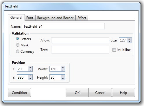
The Text input field has three modes that allow you to control what the user is able to type into the field. Letters mode is used when the user can simply enter some characters into the field, for example the name of a person. Mask mode gives you complete control over what the user can type and the positions in which they can enter characters. Mask mode is commonly used when the user must enter a date or phone number. Currency means the input field will only accept currency. Click the Letters option on the General tab of the dialog to cause the field to operate in Letters mode. This means that when running the Lesson, the user will be able to type any character from their keyboard and have it appear within the field. The text that they type will constitute their answer. A maximum of 256 characters can be entered into the field. To limit the specific characters that the user can type into the text input field, type the allowed characters into the Allow field on the dialog. This will define the Allow property for the Text Input field. For example if you type the letters "ABCD" into the Allow field, the user will only be able to type the those characters when running the Lesson. |
||||||
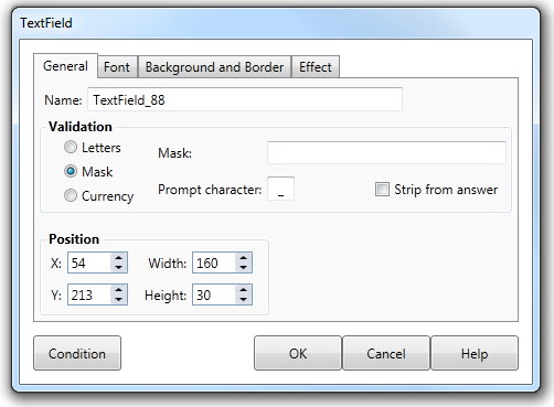
The Allow property is case sensitive so you would have to type "ABCDabcd" in the Allow field to let the user enter both uppercase and lowercase characters. The Allow property does not effect the number or order of characters that the user can enter. Thus in the above example, "AAAAC" and "DBCA" are both allowable. Alternatively, you can define the characters that the user is not able to enter. To do so precede the characters in the Allow field with the tilde ("~") character. For example if you entered "~ABCD" into the Allow field the user would be able to enter any characters other than "ABCD". To use the Text Input field in mask mode, click the Mask option. You then need to type a mask into the Value field. Each character you type into the Value field represents a position in which the user can enter a single character. The mask character you type into the Value field defines what type of text character the user can enter in that position. The table below lists the different Mask characters and the type of character it enables the user to enter. |
||||||
|
||||||
If you enter any character into the value field, other than those listed, they will be displayed in the text input field when the Lesson is run but the user will not be able to type over them. Consider the example where you want the user to type in a date, such as 04/12/1997. The text you enter into the Value field would be "##/##/19##". When the Lesson is run the user would see the field as "__/__/19__". The "#" characters mean that the user can only type numbers into those positions. Positions in which you have typed a mask character appear as underscore characters in the Text Input field. The user cannot enter any characters in positions other than those you have defined in the Mask field. You may choose a different prompt character and whether it is returned as part of the answer. |
||||||
|
||||||
If the text input field is in Letters mode you can limit the number of characters a user can type by entering or selecting a value from the Size drop down list. The user can type multiple lines by hitting the return key if the Multiline check box is active. Checking the Scroll bar check box will display a vertical scroll bar within the field on the screen. These options are not available when the Text Input field is in Mask mode. |
||||||
Font tab |
|
|||||
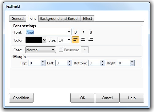
The Font tab of the Text Input field dialog contains various properties affecting the text characteristics of the field. The Password property is only available when the mode is set to Letters. Setting the check box to true will cause any text entered by the user to be replaced by the password character contained in the password field. Change the password character by typing a character into the field. The value of the field however will consist of the actual characters that the user typed. The Case drop down list can force the text the user types to be displayed in upper , lower and proper case. Choosing the proper case item will allow AUTHOR™ to determine the capitalization of letters, with sentences for example beginning with a capital.
|
||||||
Background and border tab |
The background and border tab allows you to set a background and border. It can be a range of shapes and can be colored or a gradient. By default there is no border and the background is transparent. See Background and Border tab for more information.
|
|||||
Dialog controls |
See The Interaction Toolbar for information about the dialog controls displayed at the bottom of the dialog box. |
|||||
Response testing for Text Input fields |
See The Response Add/Edit dialog and Condition filters for more information. |
|||||
Example of Text Input field |
See Response EXAMPLES for more information. |
|||||


